Using Gold History Graphs For Research And Investment
With the price of gold near all time highs more and more investors are researching gold history graphs to try to interpret future movement. This page will provide you with all of the historical gold graphs you need to educate yourself on past price movements, these are the graphs and resources I use myself. Below you will find current gold spot prices, 30, 60 and 90 day gold charts as well as 1 year to 40+ year charts.
Historical Gold Graphs (Click On The Year / Timeframe You’re Interested In):
2 Year Gold Graph | 5 Year Gold Graph | 10 Year Gold Graph | 15 Year Gold Graph | 20 Year Gold Graph | 25 Year Gold Graph | 30 Year Gold Graph | 35 Year Gold Graph | 40 Year Gold Graph / 500 Month
Live Gold Spot Price Charts to 1 Year Charts:
2 to 40 Year Gold History Graphs |
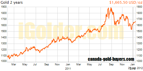
| 2 Year Gold History Graph (return to gold graph links)Start Gold Spot Price January 4, 2010: $1,121.50, End Gold Spot Price January 3, 2012: $1,598.00. Total Gain in this 2 year period of $471.50 per ounce or 42% gain. |
 |
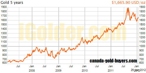
| 5 Year Gold History Graph (return to gold graph links)Start Gold Spot Price January 3, 2007: $639.75, End Gold Spot Price January 3, 2012: $1,598.00. Total Gain in this 5 year period of $958.25 per ounce or 149% gain. |
 |
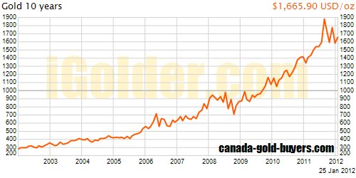
| 10 Year Gold History Graph (return to gold graph links)Start Gold Spot Price January 2, 2002: $278.35, End Gold Spot Price January 3, 2012: $1,598.00. Total Gain in this 10 year period of $1,319.65 per ounce or 474% gain. |
 |
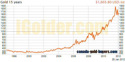
| 15 Year Gold History Graph (return to gold graph links)Start Gold Spot Price January 6, 1997: $358.50, End Gold Spot Price January 3, 2012: $1,598.00. Total Gain in this 15 year period of $1,239.50 per ounce or 345% gain. |
 |
| 20 Year Gold History Graph (return to gold graph links)Start Gold Spot Price January 2, 1992: $350.90, End Gold Spot Price January 3, 2012: $1,598.00. Total Gain in this 20 year period of $1,247.10 per ounce or 355% gain. |
 |
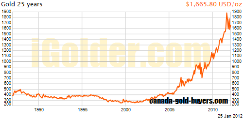
| 25 Year Gold History Graph (return to gold graph links)Start Gold Spot Price January 2, 1987: $403.50, End Gold Spot Price January 3, 2012: $1,598.00. Total Gain in this 25 year period of $1,194.50 per ounce or 296% gain. |
 |
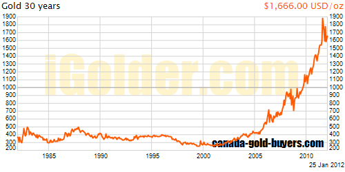
| 30 Year Gold History Graph (return to gold graph links)Start Gold Spot Price January 4, 1982: $395.00, End Gold Spot Price January 3, 2012: $1,598.00. Total Gain in this 30 year period of $1,203.00 per ounce or 305% gain. |
 |
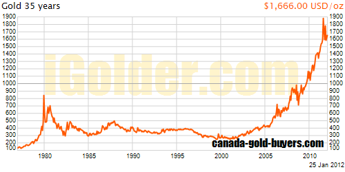
| 35 Year Gold History Graph (return to gold graph links)Start Gold Spot Price January 4, 1977: $135.70, End Gold Spot Price January 3, 2012: $1,598.00. Total Gain in this 35 year period of $1,462.30 per ounce or 1077% gain. |
 |
| 40 Year Gold History Graph (return to gold graph links)Start Gold Spot Price January 4, 1972: $45.75, End Gold Spot Price January 3, 2012: $1,598.00. Total Gain in this 40 year period of $1,552.25 per ounce or 3092% gain. |
 |
|
It turns out that you can make gold history graphs say a lot of things. Investors moving into gold respond to doubters by admitting that inflation has played a huge role in raising gold prices recently. Their confidence in the continued climb in prices is due to their belief that inflation will not be checked this time. According to their prognostications, the US government has already printed too much money. This time, they suggest, inflation will not stop and the price of gold will continue to climb. They claim that the recent setback in gold prices was just a bump in the road. As consumer prices continue climbing, so will the price of gold. |


